Binaries as images
I’m back in CAD again after a brief break, and one thing I see over and over again in the industry is Parasolid, the parametric solid modeling geometry kernel. I’m not a Parasolid expert, but either directly or indirectly, it’s always at least a little bit a part of my day.
I recently heard a co-worker state that Parasolid was something on the order of a thousand person-years worth of development in geometric modeling, and given that and that we all use it, I wanted to do something to honor this amazing fact.
Given my recent look at embedding data into physical objects with UUI-Key, I decided to go in a similar direction and look at the binary layout of the Parasolid library.
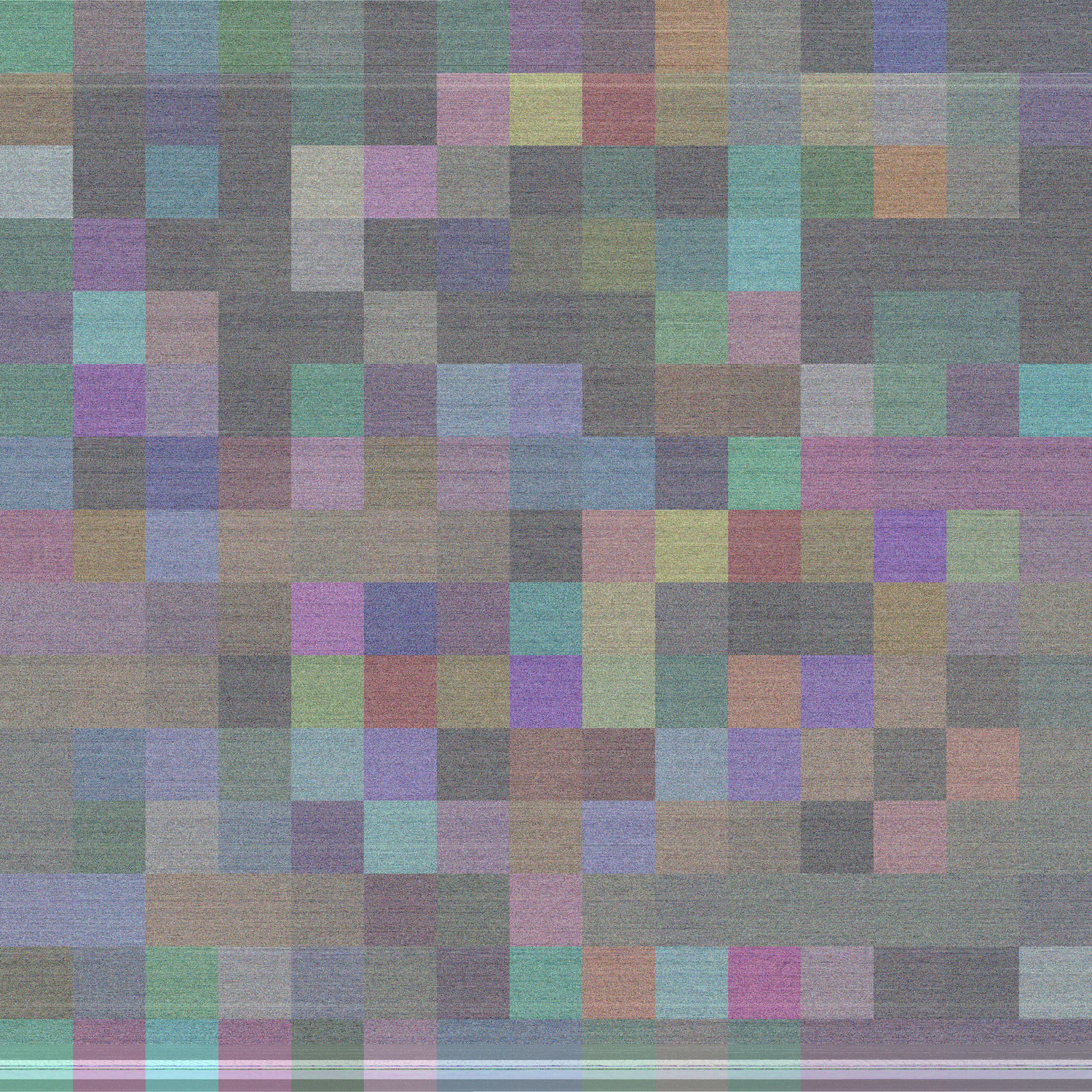
Here’s what it looks like if you interpret 32-bit words of the library as CMYK values. (I overlay a smaller, enlarged transparent section of bytes over the full collection as well to show some scale and detail.) Given a few limitations and quirks of the image creation process, reverse engineering is impossible, so I think I’m safe from the Siemens AG lawyers :)
This was so much fun that I refined the process a bit more and made a collection of images of files you’ll probably recognize.
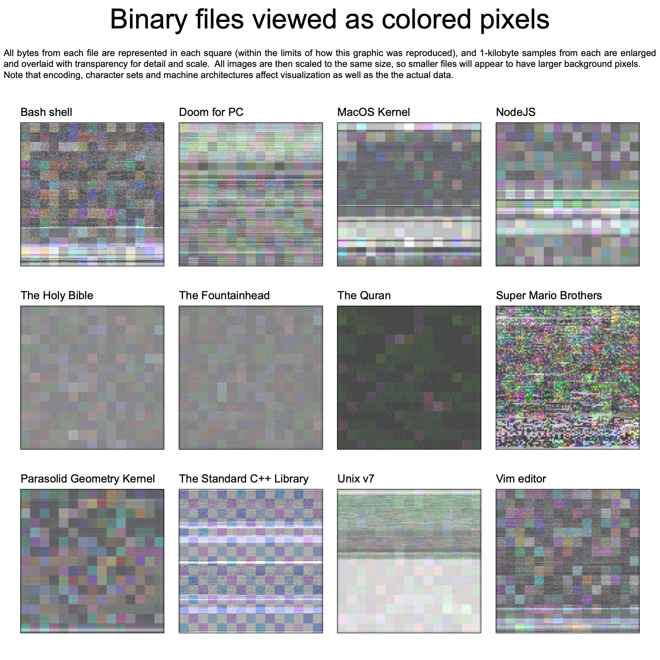
Here’s the source for the script to make these images. A large part of this code was an airplane challenge.
A few disclaimers:
-
There are a many ways to encode, decode and interpret bytes as pixels, and I wanted to use 4-bytes in a word for one color value, so I went with CMYK. This is roughly equivalent to 1-2 pixels per machine-code instruction. Having said that, if you put a BMP or TIFF into this script, you’ll get back something that looks like the scrambled cable channels you tried to watch as a teenager in the 90s.
-
There are no embedded secret codes or hidden agendas here. Looking at data as pixels will reveal a few fun trends, often relating to the size of the file and if it has large sections of constant or repeated values, but character encoding and machine architecure has a lot to do with it, so don’t read too much into any of the images – no one is claiming that vim predicts that the world will end in 2027 :) Having said that, I think the Parasolid image is the most beautiful, but of course I’m biased.
One inspiration for all of this is the bogus numerology that people apply to politics—-like if you take the numbers corresponding to the letters in “COVID-19” and add them up and put them in a 2x2 grid, you can see “666” or some garbage like that. I was reminded of how you can take any data at all, massage it with a mapping function, and have it prove any crazy agenda you want. So, I wanted to take this concept but with a positive message of color rather than conspiracy.
I’m hardly the first person to do this — “Glitch art” started in the 1930s with experiments with film and continued all the way to Nine Inch Nails album covers in the 2000s. My idea to use existing popular media as a source is sort of my take on all of it.